DES166 Project #1
Voices of the City is a living archive of human moments - recorded in streets, subways, rooftops, and corner cafés. It’s a love letter to the rhythm, chaos, and quiet truth of urban life.

Role
Product Designer
Duration
May 2026
Responsibility
UX/UI Deisgn
Type
Hackathon (team of 3) → Solo Revision
Problem
Some feelings have nowhere to go
This is Minji.
Minji is a sophomore studying abroad in the US. Today she found out a girl from her class added everyone on Instagram after their group project.
Everyone except her.
Maybe she just forgot. Maybe she didn't.
It's too tangled to bring up. Too real to just let go.
Not the kind of thing you text someone about, and definitely not the kind of thing you post online.
So it just sits there.

Pain Point
Why existing spaces fall short
01. No safe place to just say it
Too small for therapy,
too personal for social media.
02. Too close to say out loud
Some things are too small to worry your friends
with, or too big to know where to start.
03. Every platform expects something back
Likes, followers, comments, opinions. There's
nowhere to just say something true without it
becoming a thing.
04. Carrying it alone feels heavier
Writing it down helps. But knowing someone else
felt it too. That's what actually makes it lighter.
How might we…
give people a place to say the things that don't fit anywhere else, and let them discover they were never as alone as they thought?
Research
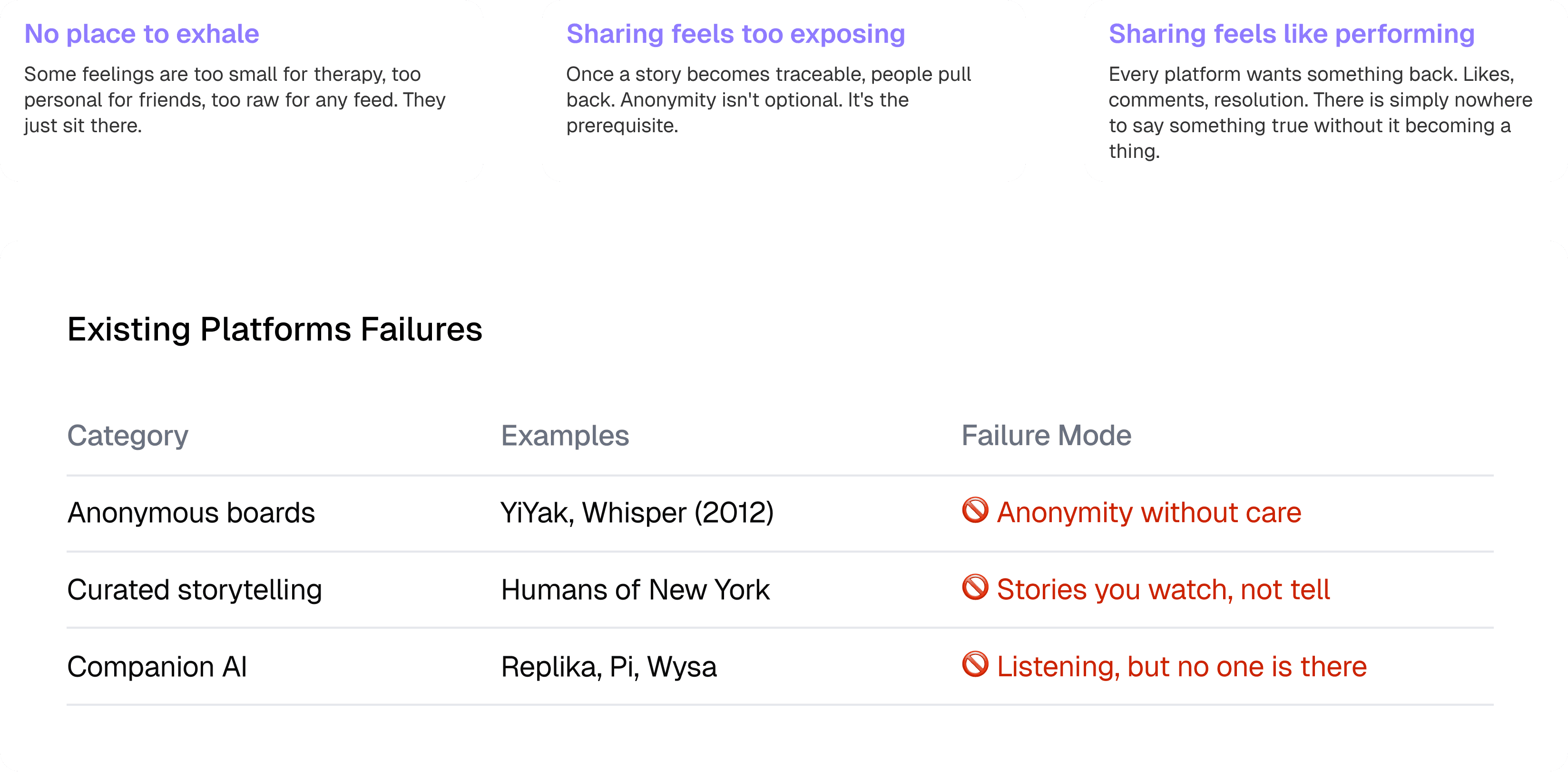
Three Walls That Keep People Quiet
The problem is not that people lack the desire to share. Every existing platform breaks trust at one of three structural points.
Insight
You Don't Need an Audience. You Need an Echo
Every competitor assumes the goal is to be heard by friends, followers, a community, or an AI. That assumption is wrong.
Users carrying these feelings do not need witnesses. They need confirmation that they are not singular in the feeling. That distinction eliminates the need for any audience at all - and points directly to the product's core mechanic.
Ideation
The Smallest Thing That Could Make Someone Feel Less Alone
이거슨 너가 채워봐
Interaction
What the Product Refuses to Do Is the Design
이것도 너가 채워봐 내가 한 것들 내 포폴에서 따왔어 참고해. 내용은 줄게.
Removed -> The echo found screen has no buttons
The interaction design is the absence of interaction - deliberate stillness in a product that otherwise always has a next step.
Constrained -> "See next echo" requires a deliberate tap
A low-prominence text link, not an auto-advancing feed. Prevents compulsion without removing the option.
Removed -> The Insights calendar does not push
Pattern is offered quietly, on the user's terms. The Reflect prompt is a question, not a directive.
Removed -> No social graph anywhere
No follower counts, no comments. The only visible numbers are personal. Nothing to optimize for.
What I Killed, and Why
Three features were removed entirely when walkthroughs revealed they undermined the core principle.
Judgmental Color-Coding: Red/yellow/green cues felt like "moderation" to 6 of 9 participants. Shifted users from reflective to defensive mode.
Rigid Tone Presets as Default: Locked categories failed edge cases. Replaced with a single swappable slot.
Regenerate-Only Rewriting. Lowered perceived authorship in testing. Replaced with "Here's Why" so users rewrite in their own words.
Reflection
What Silence Taught Us About Design
What worked: The echo is the idea. Anonymous boards tried anonymity. Companion AI tried listening. Curated platforms tried storytelling. None tried matching the feeling without connecting the people. That is Whisper's contribution. The conversational home was the right call. Four prompts do more design work than any other element in the product.
What I would do differently: The Explore tap-into-bubble experience is undesigned. What happens when a user taps Loneliness (142)? The tension between discovery and privacy is real and unresolved. Echo matching quality is the make-or-break risk. A mismatched echo breaks the trust the entire product rests on.