
Physical Product Design
01
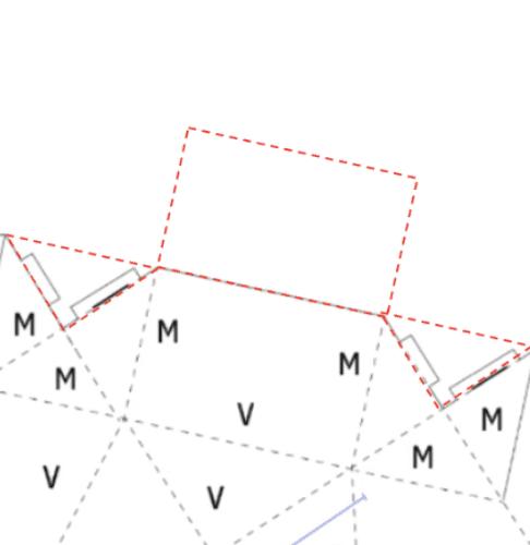
Net Diagram
Final net diagram used for the physical prototype

02
Design Challenge
Goals
✅ Visually appealing form
✅ Stable transportation
✅ Comfortable to carry
✅ Clear opening interaction
03
Scenario Storyboard
A storyboard illustrating the customer journey from selecting a plant to displaying it at home.


Customer selects a small plant as a gift at a local plant shop.
The plant is placed inside the carrier at checkout.
The integrated handle allows comfortable one-handed transport.


The structure keeps the plant stable while traveling on a bus.
The carrier unfolds into a memorable gifting presentation.
The carrier remains as a decorative planter cover after gifting.
04
Concept Exploration
Prototype A: Heart Carrier


🚫 Doesn't have a locking mechanism for the lid
🚫 Inconvenient without a handle
Prototype B: Lantern Carrier


🚫 Looks like a bird cage(?)
🚫 Inconvenient without handle
🚫 Overall not very appealing as a plant carrier
Prototype C: Geometric Carrier
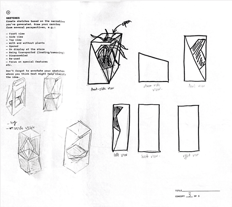

🚫 Height differs between front and back triangles
🚫 Redesign needed to hold without any tape
✅ Visually strong
✅ The unique handle works well
> worth developing further!
05
Iteration Journey
Through repeated testing and feedback, each prototype revealed new issues and guided the next design decision.
TEST #1


Changes
✅ Matched front/back triangle height
✅ Introduced tabs and slots
Issues Found
🚫 Tabs became loose easily
🚫 Opening felt unclear
🚫 Bottom felt visually weak
TEST #2


Changes
✅ Introduced a two-side front opening
✅ Added triangular points at the bottom corners
Issues Found
🚫 Four inch base too narrow for pot
🚫 Handle shape unclear at first glance
🚫 Tabs unstable from size and placement
🚫 Bottom tabs stick out, awkward and nonfunctional
🚫 Top triangular points collapse without tape
🚫 Cover exposed front triangle cut for appearance
TEST #3


Changes
✅ Refined handle shape to read as handle
✅ Expanded base edge to 4.5 inches
✅ Placed all tabs at one-third point, hidden inside
Issues Found
🚫 Base still needs additional width
🚫 Top triangular structure still hard to secure
🚫 Extra face to hide cut edge proved structurally unfeasible
TEST #4 - FINAL

Final Improvements
✅ Discard the idea of hiding the visible cut edge on the front for possible design
✅ Added internal tabs to secure triangular points
✅ Changed the opening handle to a triangle to indicate direction while matching
the angular concept
✅ Expanded one side of the base to 5 inches, now it fits perfectly
✅ Changed outer folds from mountain folds to valley folds for a cleaner appearance
06
Final Outcome
The final design achieved a balance between visual identity, stability, and user interaction.


✓ Comfortable carrying experience
✓ Stable and secure transportation
✓ Visually unique design
07
Reflection
This project showed me how repeated prototyping can gradually strengthen a design over time. Through multiple iterations, I was able to refine the visual form, improve stability, and create a clearer interaction for the user. While the final design achieved most of my goals, if I could continue this project, I would continue improving the handle and tab system with a more secure locking mechanism to make the structure more durable during transportation.